Klein Group investment firm reached out to Johanna Forss and I to help them create a graphic identity, logo and UI/UX prototypes for one of their most ambitious ventures yet: Morten Klein's e-commerce start up, QRTD. QRTD offers a new type of shopping experience, where creator content introduces users to different products.
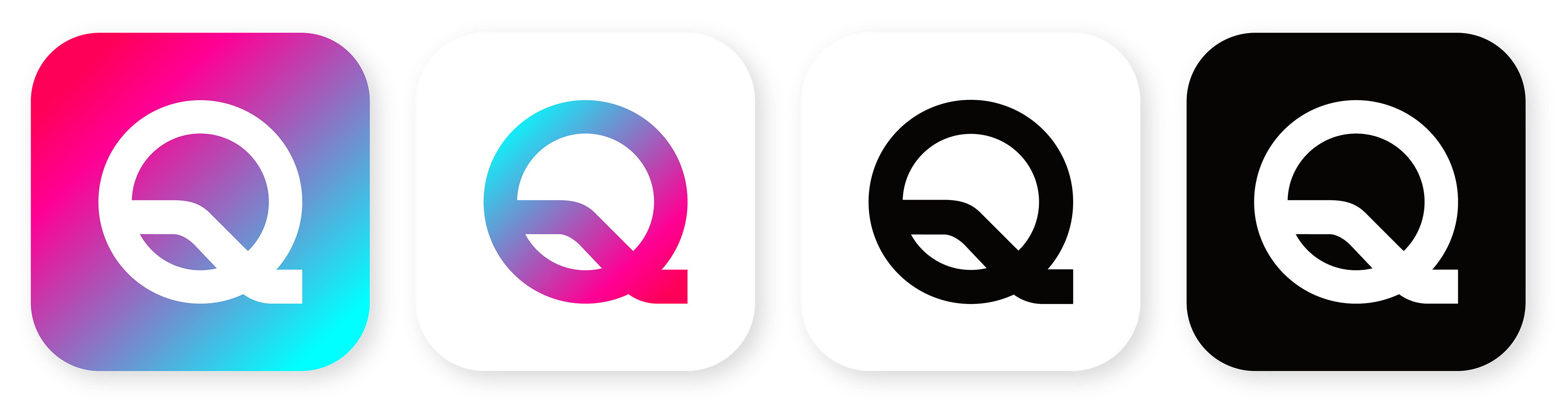
Whilst the brand colours were pre-defined to be pink and turquoise, we had free rein to explore graphic identities and different logo styles. The final expression was to be bold, energetic and sophisticated. This exploration resulted in the QRTD logo above. This typeface reflects the ethos of QRTD: self assured and bold.
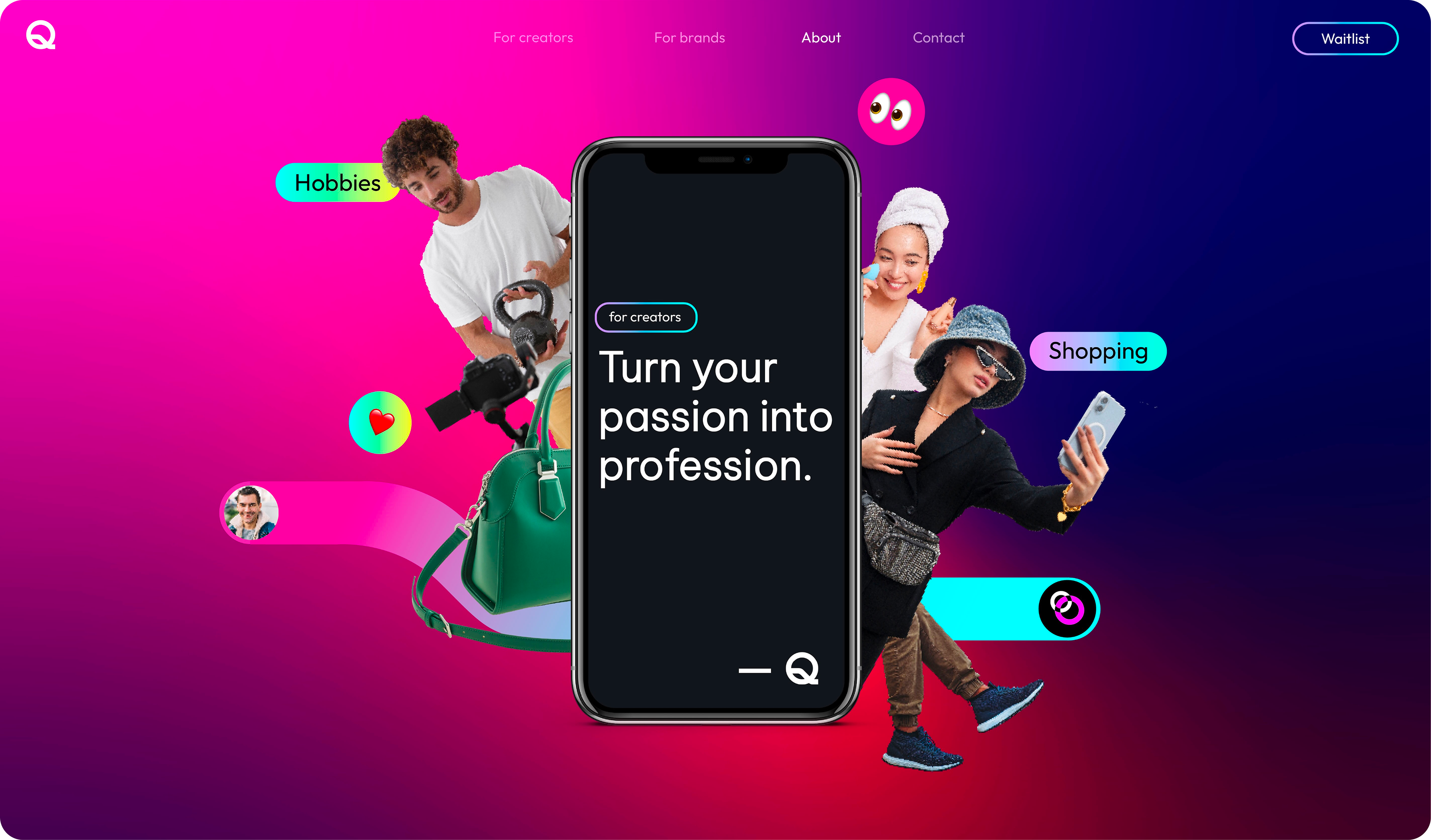
We contextualised the brand through various different contexts, like social media campaigns and website design. During these explorations, we were looking for different identifying markers that could act as a common thread through QRTD's various different profiles. We also experimented with different typefaces before landing on "Be Vietnam Pro" for headers and "Outfit" for body texts.
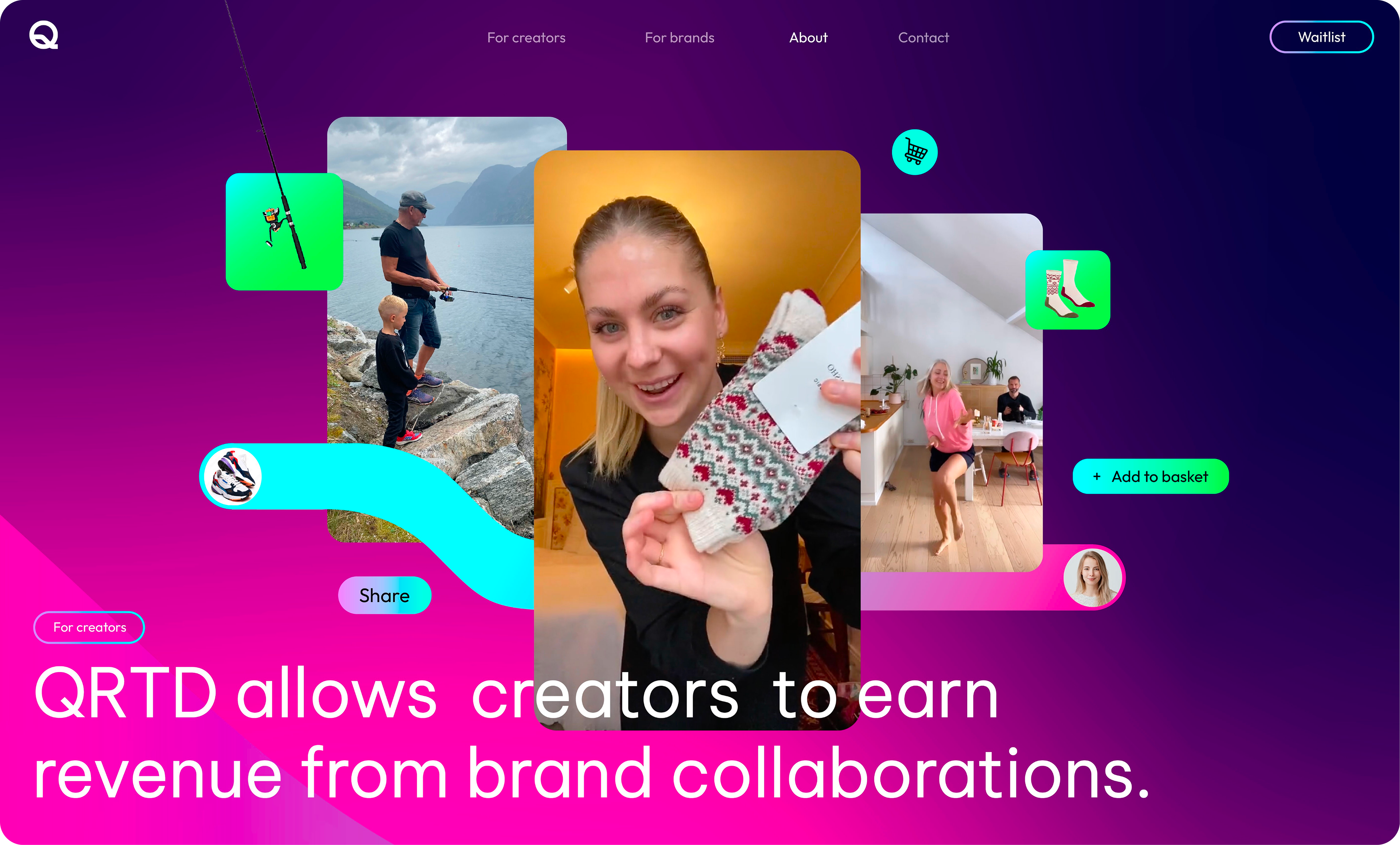
It was important for these trademarks to be versatile enough for different contexts and also to not exclude different types of users and influencers. Shapes that mimicked the various curves of the QRTD logo, gradient lines connecting brand/creator and product together, tertiary colors that could bring a more unisex expression to the primary turquoise and pink brand colors were some of the common QRTD identifiers we defined.
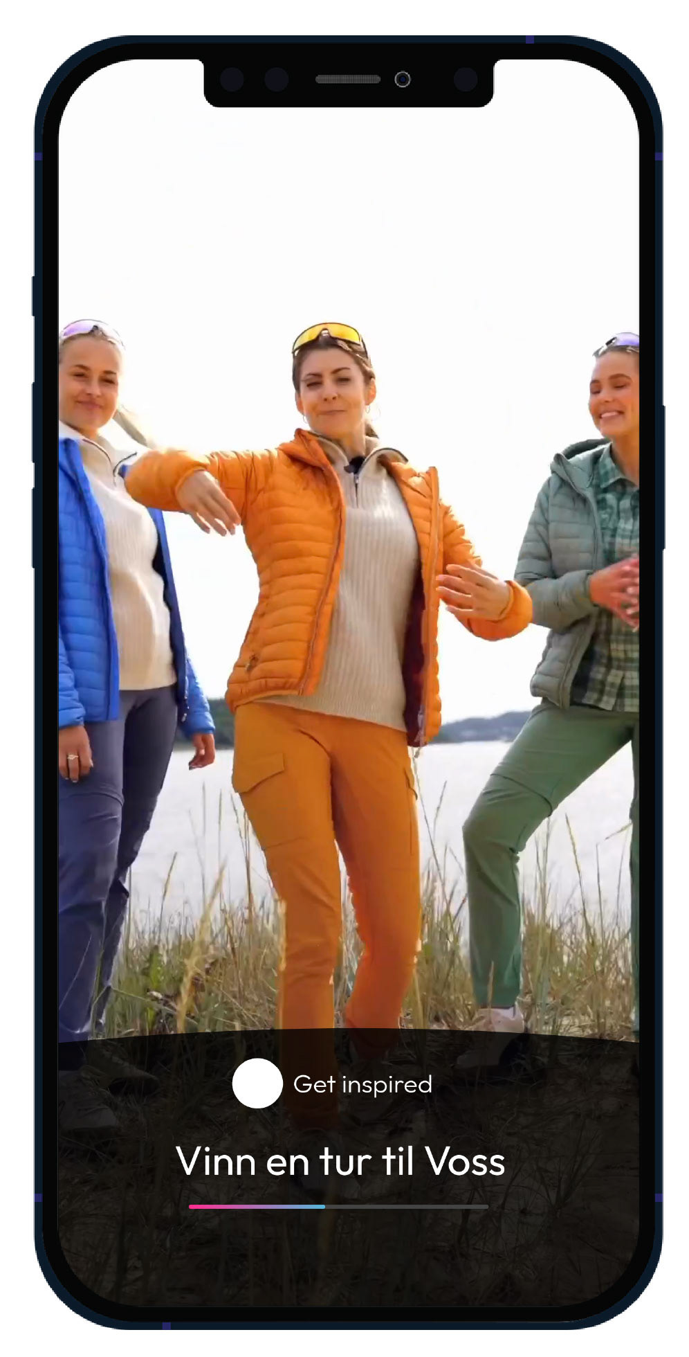
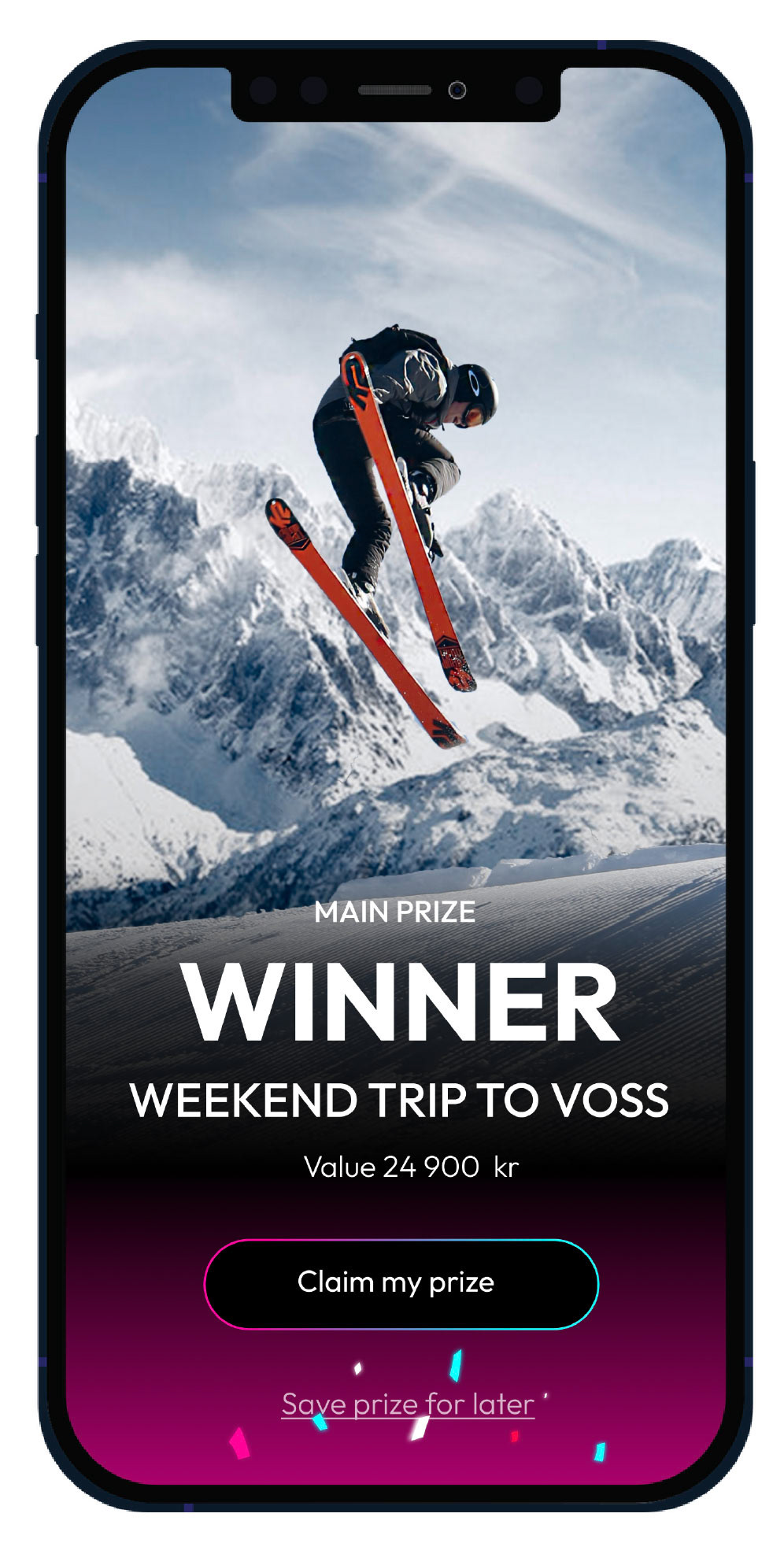
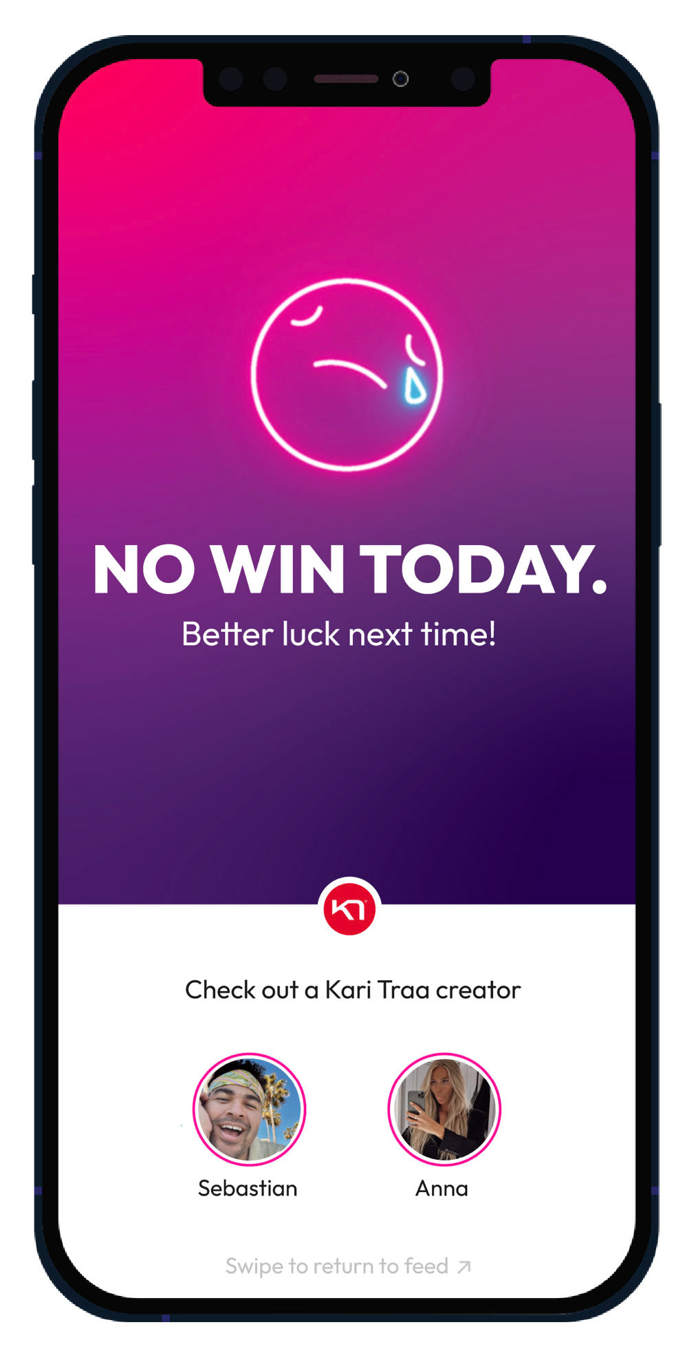
We also created UI/UX flows for a "spin to win" game in the QRTD app. This further allowed us to contextualise the brand through different user experiences.
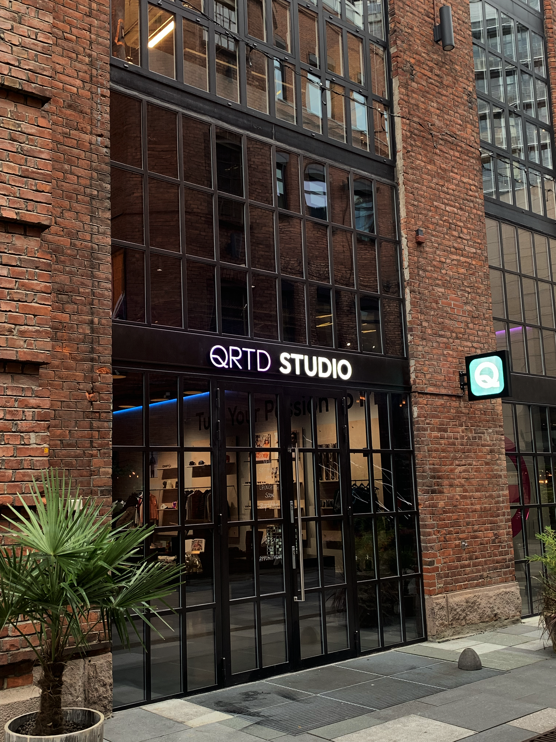
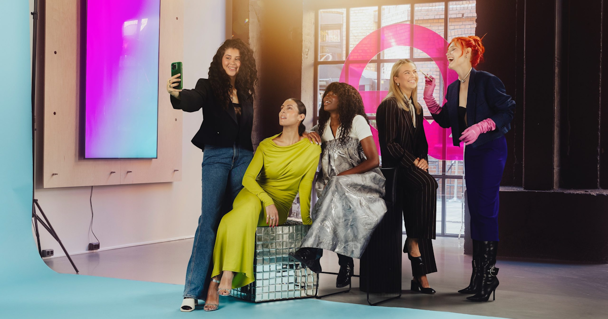
QRTD studio and shop at Akerbrygge, Oslo
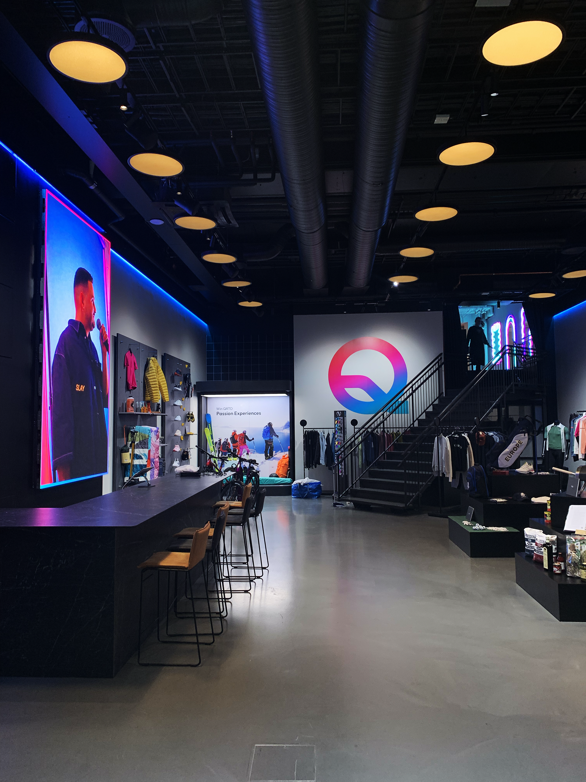
QRTD studio and shop at Akerbrygge, Oslo
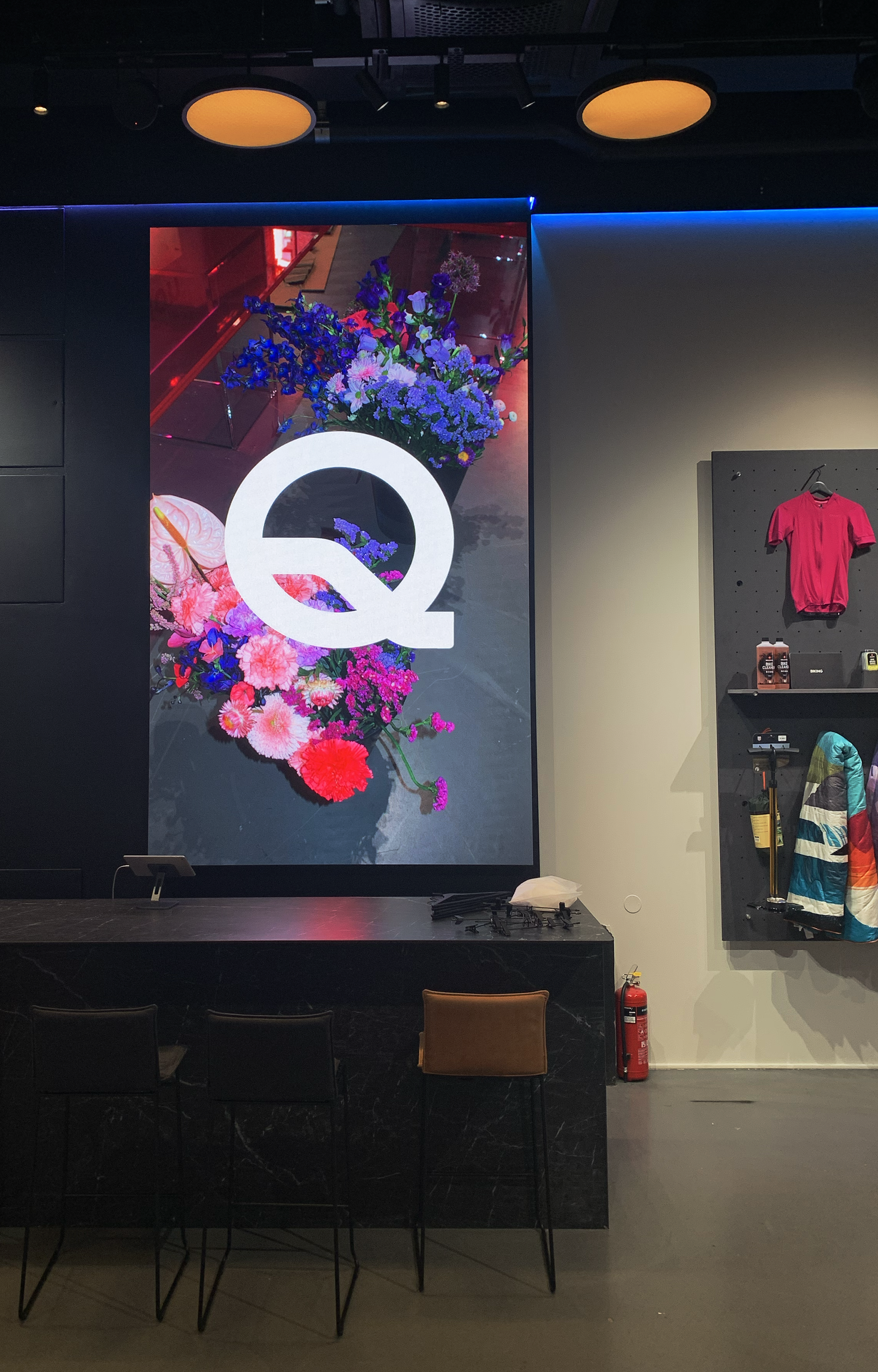
QRTD studio and shop at Akerbrygge, Oslo
Although we did not take part in the interior design of the QRTD store at Akerbrygge, it was incredibly rewarding to see the identity we helped create find its place in a little corner of Oslo.